moving the letters closer together; the sixth by
moving the letters farther apart.
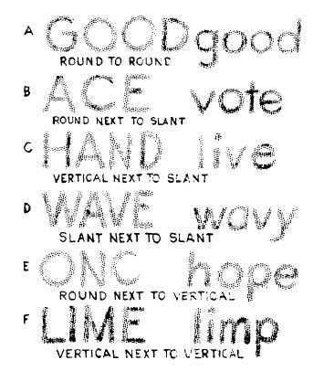
1. Round next to round. (Increasing area at
top and bottom where letters curve away from
each other, as in figure 3-55A).
2. Round next to slant. (Increasing area at top
or bottom where letters move away from each
other, as in figure 3-55B).
3. Vertical next to slant. (Increasing area at
top or bottom where one letter slants away from
the other, as in figure 3-55C).
4. Slant next to slant. (Increasing area at
top or bottom where letters slant in opposite
directions, as in figure 3-55D).
5. Round next to vertical. (Increasing area at
top and bottom where round letter curves away,
as in figure 3-55E).
6. Vertical next to vertical. (Decreasing area
at top and bottom where stems move together,
as in figure 3-55F.)
A good way to evaluate the spacing of letters
is to hold the lettering away from you and squint
your eyes, observing the gray tone throughout the
45.207
Figure 3-55.-Common spacing problems.
lettering. If the tone appears spotty or varies too
much, the letters are poorly spaced.
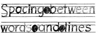
WORD SPACING
Proper spacing between words is an important
factor in making them easy to read. Allow enough
space between words and sentences to keep them
from running together, but not so much as to
cause words to be read one at a time. A good
practice to follow is making spaces between words
equal to the space that the letter O occupies as
shown in figure 3-56. If you prefer, you can use
the letter N or a correctly spaced letter I instead.
Naturally, the design of the last letter of a
word and of the first letter of the following word
must be considered in determining the amount of
space you leave between words. You should leave
a space equal to a capital O between two
full-height straight-stemmed letters, such as H and
E or D and B. Of course, if one or both of the
letters are curved, the space should be appropri-
ately reduced. If the two letters involved are
lowercase, use the lowercase o to determine the
width of the space. If one letter is full height and
the other is lowercase height, such as the words
bid now or on him, the space would be equal to
half a capital O and half a lowercase o.
LINE SPACING
In addition to the spacing between letters and
words, the spacing between lines of lettering adds
to the readability of the lettering. Again your eye
and your artistic ability must be your guide.
Except when you are trying for a special effect,
you should have enough space between the lines
to make it easy for the reader to see what he is
reading.
The distance between lines may vary from
1/2 to 1 1/2 times the height of the letter, but for
the sake of appearance, it should not be exactly
45.207A
Figure 3-56.-Spacing between words and lines.
3-36