the same as the letter height. As a general rule,
two thirds of the letter height is a good distance
between lines. This spacing allows room for
descenders of lowercase letters and still maintains
a clear space of one third of the letter height
between the descenders and capital letters, or
ascenders of lowercase letters of the following
line. Figure 3-56 shows proper word and line
spacing.
CENTERING
Since the letters of the alphabet vary in width,
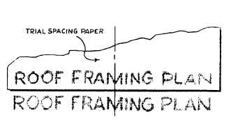
it is rather difficult to center a line of lettering.
Figure 3-57 shows one way of solving this
problem. First, take a piece of scratch paper
and letter in the required line. Then, place
this lettering above the area in which your
lettering is to go and center it. Finally, use
the sample as a guide to lettering the desired
line.
Ending a line of lettering at a given point is
equally difficult. As in centering, first, letter the
line on a piece of scratch paper in order to achieve
the proper line length.
To make lines of lettering come out to a
specified length, you must adjust the word and/or
letterspacing. This adjustment in spacing is called
JUSTIFYING. A good example of justifying is
found in the columns of this manual. Notice how
all full lines start and stop on the right- and left-
hand margins. Usually, you will only find justified
lettering typeset or typewritten by mechanical
means. However, if you do have an occasion to
justify your lettering, you should try to keep
the spacing between the words as uniform as
possible. Uneven spacing detracts from the
appearance of the job. When it is impossible
45.217
Figure 3-57.-Centering with trial spacing paper.
to divide the spacing evenly, insert wider spacing
at points where one word ends and the next begins
with tall letters, like d, b, and l.
If you use too much space between the words,
the paragraph will tend to fall apart because it
is filled with rivers of white space that will disturb
the eye.
When a line is so short that it calls for an
undue amount of space between words to lengthen
the line, allow more space between the letters in
each word. This is known as letterspacing. When
words are letterspaced, always allow extra space
between words so that they will not seem to run
together when they are read.
Letterspacing makes short words in titles or
headings appear longer. Though it frequently
improves the appearance of words in caps, letter-
spacing reduces the legibility of words in
lowercase, Therefore, the process must be used
with caution.
MECHANICAL LETTERING
In chapter 2 we discussed pens that are used
primarily for freehand lettering. At times,
however, you will be tasked with preparing
drawings, charts, maps, or signs that require the
use of mechanical lettering. When we refer to
mechanical lettering, we mean standard uniform
characters that are executed with a special pen held
in a scriber and guided by a template. Mechanical
lettering does not normally require the use of
lettering guidelines. You will use mechanical
lettering principally for title blocks and notes
on drawings, marginal data for special maps,
briefing charts, display charts, graphs, titles on
photographs, signs, and any other time that clear,
legible, standardized lettering is required. It
should be noted that freehand lettering is the
required lettering on most of your drawings;
mechanical lettering should be confined to special
uses similar to those described above. The
availability of mechanical lettering devices should
not deter you from the daily practice required to
execute freehand lettering. With continuous
practice you will become proficient with both
mechanical and freehand lettering.
One of the most popular types of mechanical
lettering sets is the LEROY lettering set. A
3-37