45.837
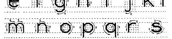
Figure 3-51.-Lettering vertical lowercase letters.
Lowercase letters should NEVER be used on
drawing title blocks. Figure 3-51 shows lowercase
letters along with guidelines and strokes used to
form each letter.
The crosses of f and t are on the waist line and
extend the same distance on either side of stroke 1.
The horizontal stroke of e is just above midheight.
The bodies of a, b, g, p, and q are circular and
vertical strokes of these letters do not increase
their width at the points of tangency. The vertical
strokes of p and q terminate at the drop line. The
vertical strokes of g, j, and y terminate in curves
that are tangent to the drop line.
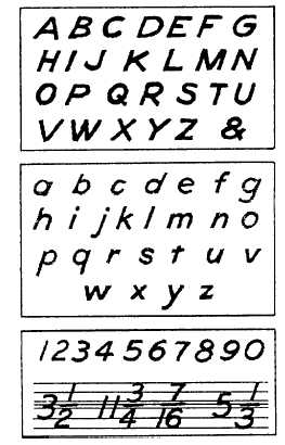
INCLINED LETTERING
Inclined single-stroke Gothic lettering is also
acceptable on SEABEE drawings, although it is
not recommended for the beginner and should not
be attempted until you have mastered vertical
lettering techniques. Inclined and vertical lettering
should never appear on the same drawing. The
lettering style used must always be consistent.
Figures 3-52 and 3-53 show the required
formation of inclined letters. The angle of
45.210
Figure 3-52.-Inclined single-stroke Gothic.
3-34