in the center row are equally spaced guidelines.
The two outside rows are used for drawing both
capital and lowercase guidelines. The left row
gives a proportion of 3 to 5 for lowercase
and capital letters, and the right row gives a
proportion of 2 to 3.
The design of the Ames lettering instrument
permits you to use it for lettering ranging in height
from 1/16 to 5/16 in. These various heights are
attainable by rotating the circular disc within the
outer section of the instrument. The numbers
along the bottom edge of the disc are used to set
the instrument for a particular letter height. A
number aligned with the index line on the outer
section of the instrument indicates the height of
the lettering in 32ds of an inch. In figure 3-43,
view B, the number 8 is aligned with the index;
therefore, the distance between the capital letter
guides produced by this setting is 8/32 in. or 1/4
in.
By standing the Ames lettering instrument on
its greater sloping side, you can use it for
drawing guidelines for inclined lettering that slope
at an angle of 67 1/2 degrees with the horizontal.
(See the upper-right portion of fig. 3-43, view B.)
Spacing Between Guidelines
The spacing between two lines of capitals
may vary from one half of the height to the full
height of a capital. Two thirds of the height is
customarily used.
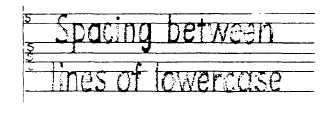
The spacing commonly used between lines of
lowercase letters is shown in figure 3-44. The space
indicated by the letter S equals the vertical distance
between the waist line and the cap line.
VERTICAL SINGLE-STROKE
GOTHIC LETTERING
The generally accepted style of lettering for
SEABEE drawings is the single-stroke Gothic
45.214
Figure 3-44.-Spacing between lines of lowercase letters.
45.832
Figure 3-45.-Vertical single-stroke Gothic capitals and
numerals.
vertical (fig. 3-45) or inclined lettering. The term
Gothic refers to the style of letters. Gothic
lettering is the simplest style to make and the
easiest to read on a drawing. Single-stroke means
that each stroke of the letter is made by one stroke
of the pencil. Figure 3-46 shows the basic strokes
required for single-stroke lettering. Vertical
strokes are drawn from the top down with an even
finger movement. (Inclined strokes are drawn in
the same manner.) Horizontal strokes are drawn
from left to right with a complete hand
movement, pivoting at the wrist. Curved strokes
proceed from above downward, using a combined
finger and wrist motion. Lettering strokes are
drawn, not sketched. It is important that you use
the correct direction and sequence of strokes
recommended for each letter.
The required shapes of vertical single-stroke
Gothic letters and numerals will be shown and
discussed in the next several figures and
paragraphs. To emphasize the proportions of the
letters and numerals, each character is shown in
a grid, six units high. The grid serves as a reference
for comparing the height of the various characters
in proportion to their width as well as locating
the individual strokes that compose the characters.
3-30